平面設計師白井敬尚擅長文字設計,密密麻麻、資訊豐富卻混雜的文字,經過他的整理後,文字的版塊與空間的版塊配合有置。版面時而活潑,時而嚴肅,而且即使再俱個性,都非常易於閱讀,單是透過版面的設計,似乎已經能夠感受到內容想要傳達的訊息。日文中「組版造形」一字,是指紙面上,文字與空間的配置,白井敬尚在擔當《Idea》雜誌的美術總監的十年裡,組版造形的功力在雜誌設計上大放異彩,每一期都被視為值得收藏的珍品。
位於京都的DDD Gallery現正舉行「組版造形 白井敬尚」展,展出他多年來參與過的書籍及平面設計。以文字作為設計主體的他,作品也多以黑白為主,這使是次展覽在觀感上與一般設計展大相逕庭。除了作品外,亦會展出白井敬尚工作時的參考資料,參觀者會發現看似簡單的一冊書籍設計,原來是大量知識,長時間的探索與研究、長年經驗的集成。
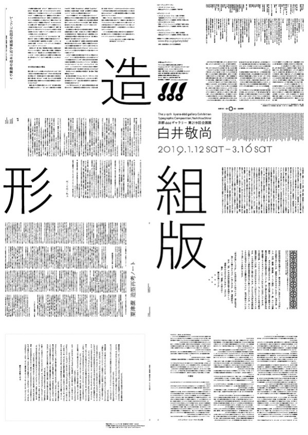
Typography is one of the specialties of editorial designer Yoshihisa Shirai. His designs usually involve a large amount of information and text, but he has a way to achieve a well-balanced setting to properly lay down the blocks of text and white space between the lines. His typography designs come with all kinds of styles from a lighthearted approach to formal layout. Regardless of his distinctive style, his designs are extraordinarily easy to read. One can almost grasp the general message of the content just by looking at the typography design. Typographic composition is the concept of arranging text and whitespace in editorial design. During his term serving as the artistic director of Idea magazine for 10 years, Shirai’s superb craftsmanship in typography design was given the best stage, making every issue considered a work worthy of any collection.
Kyoto-based DDD Gallery is now hosting the Typographic Composition, Yoshihisa Shirai exhibition that showcases books and other graphics designed by Shirai over the years. Text is the principal medium of Shirai’s designs, his graphics are therefore mostly in black and white. This makes his exhibition distinctive from the vibe of most of the other design exhibitions. On top of his works, reference materials used in the creative process are also showcased. Visitors would realize how book designs that apparently look simple actually require an abundance of knowledge, research, and experience to produce.