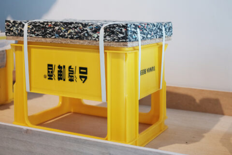
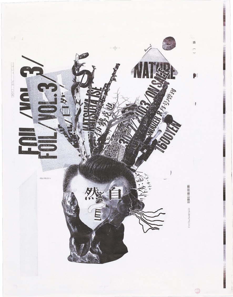
2000年11月出版的《IDEA》雜誌,開首的48頁,紙張特別單薄。《IDEA》一向對印刷及紙質極為講究,重視紙張是否能夠真實地顯示出作品的色彩,偏偏那次專題選用的紙,對顏料極為抗拒。想必負責跟進製作的同事,大概花了不少功夫,才讓紙張上的照片如此清晰地呈現出來吧。製作這個48頁專題的,正是當期《IDEA》封面上的人物——平面設計師、藝術家立花文穂。
The IDEA magazine that was published in November 2000 used an unusually thin type of paper for the first 48 pages. The IDEA magazine is always particular about printing and the choice of paper, so as to manifest the color in the most vivid way. Rather contradictorily, the type of paper used for that issue was rather reluctant to demonstrate color in full. The person in charge of that issue must have spent a great effort to have the images printed so clearly on the paper. This person was in fact the one featured on that issue’s cover, the graphic designer/artist Fumio Tachibana.
立花文穂的作品,總予人原始的感覺。雖然在數碼化的時代,不少設計師如他,嘗試透過紙張的質感,以及凸版印刷等的技術,來增加作品的溫度,然而立花文穂所追求卻有所不同。對於設計上的用紙,立花文穂有著難以想像的寬容。「我喜歡的紙張通常都已停產了。近年來,不時也以消耗已經剪裁過的、手邊有的紙張為前題造設計,可以說是為了減少存貨吧。所以,也可以說我對紙張不太講究。當然紙張及墨水的關係、與內容的平衡也很重要。」立花文穂在與另一位設計師葛西薰的對談中說。雖說立花文穂說他對紙張不講究,然而從他自己設計的書籍中,仍能感受到他有自己的偏愛,就是像為《IDEA》的選用的紙張一樣,看來很廉價的紙張,軟趴趴的。在他的《Kurara洋裁研究所》一書中,他甚至用上了現時大都只用來包裝工業製品的Kraft Paper。
Works of Fumio Tachibana always appears so down-to-earth. Many designers of the digital era would make use of the texture of paper or techniques like letterpress printing to bring more layers to their work. Tachibana, however, has a different approach. He is surprisingly open to the choice of paper. “The types of paper that I like to use have stopped being manufactured. In recent years, I would simply use paper that is lying around, or those that I have cropped before for my design. This is sort of a way to help to eliminate my stock. I am, therefore, not so picky when it comes to the choice of paper. Of course, I would not deny the importance of striking a balance among paper, ink and the content to be printed,” says Tachibana in a dialogue with another designer, Kaoru Kasai. Although Tachibana says he is not particular about the choice of paper, his preference is nevertheless obvious in the books he designed. For instance, the cheap looking, insubstantial paper used in the IDEA magazine, or to print his own book Kurara Yosai Kenkyujo (Clara Dressmaking Institute) with the kraft paper, which is usually used for wrapping industrial product.
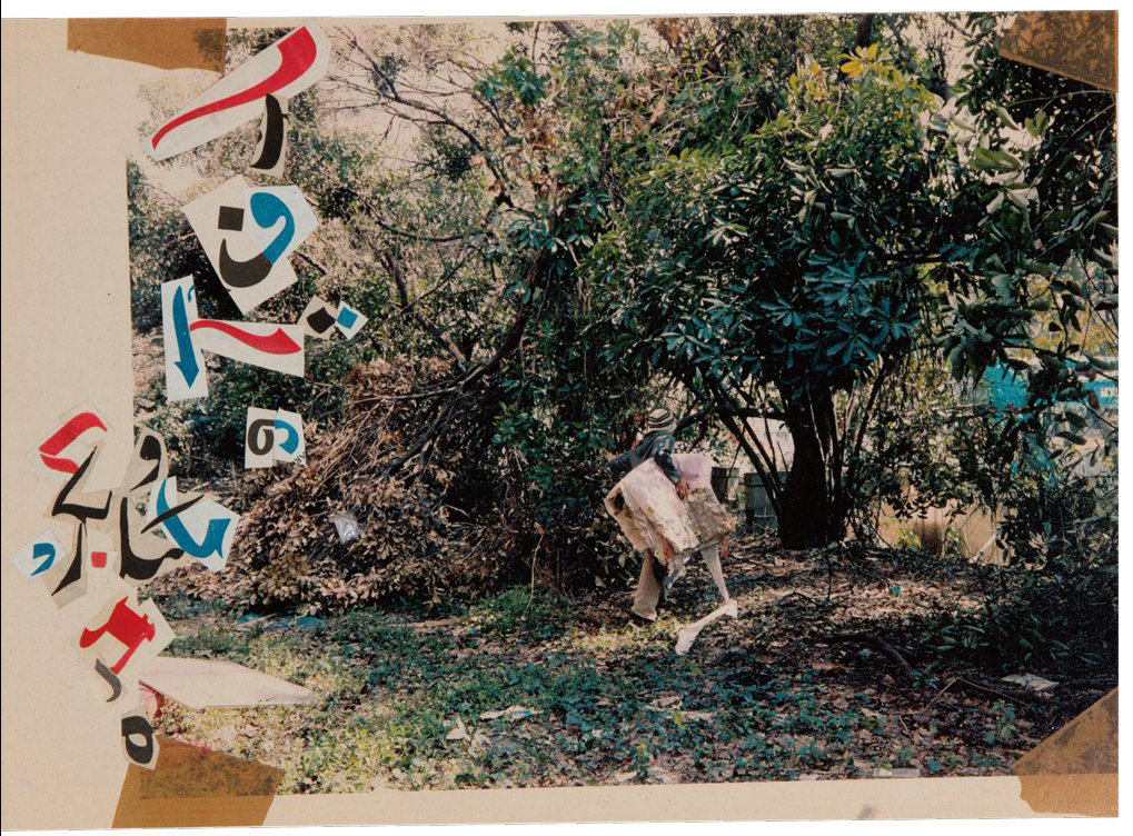
立花文穂有拾紙癖,他曾笑言,自己每次走在路上,遇到殘殘破破的廢紙時,似乎都能聽到「路上的紙張把我叫停,問我:『要拾起我嗎?』」在《Leaves:立花文穂作品集》之中,收錄了立花文穂寫於印度的日記,全都跟他與紙張的相遇有關。在賣筆記簿的小攤檔,要求老闆賣出其用來試筆的殘舊筆記;以拾到的厚紙咭貼在紙碎造成明信片;街上偶遇破爛的報紙,拾起將之攤平整理之時,身旁大叔突然把自己手上整潔的一份塞給他,他勉強收下後發現報紙上滿是大叔塗鴉,頓感如獲致寶⋯⋯立花文穂收集廢紙,其實也是在收集文字。
Tachibana has an obsession with collecting paper. He jokingly said, every time wandering on the street, he could hear phantom voice of the waste paper mumbling to stop him, saying, “do you want to pick me up?” In Leaves: Fumio Tachibana, the diary entries he wrote in India were all related to paper. At a roadside stall that sells notepads, he would ask to buy the torn one that was used to test new pen; he would glue cardboard and scrap paper together to make postcards. Seeing shabby newspaper lying on the street, he would pick them up before flattening them; while doing so, a man standing next to him handed to him a clean and intact pile of newspaper, he took it reluctantly, but soon find out the pile of paper was filled with the man’s sketches and notes which he received in delight. While collecting scrap paper, Tachibana is as well collecting words.
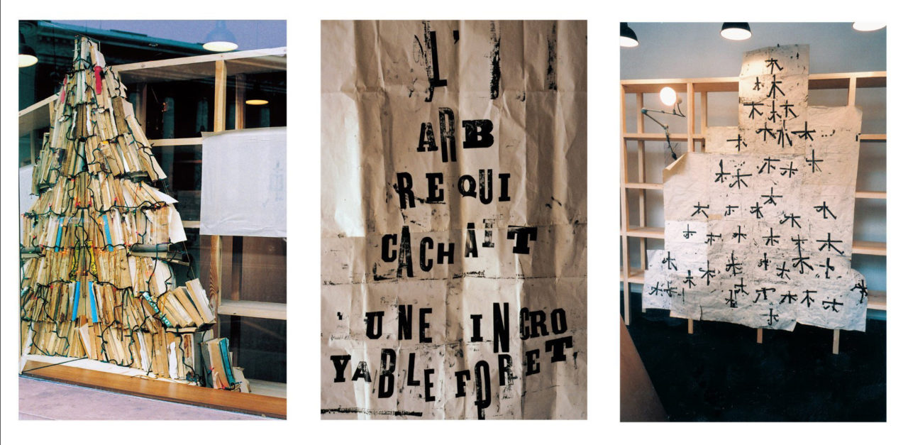
立花文穂做設計書籍、海報,也做裝置藝術,而他大部份作品都離不開文字及紙張這兩個素材。於2005至元2006年間,他替巴黎Shiseido製作的裝置藝術展「木の中に森が見える」(中譯:在樹木裡看見森林),大量在日常生活裡教人聯想到樹木的素材堆堆疊疊,如山的椅子、如聖誕樹的舊書,還有很多很多被捏得滿面皺紋的紙張,印著東歪西斜的文字。像給風吹至紛亂的一堆「木」字裡,我們真的看到了「森」與「林」,貼題不過。
Apart from designing books and posters, Tachibana also creates installation art. Regardless of the variety of media, the majority of his works use text and paper as the key elements. From 2005 to 2006, Tachibana has created for Shiseido Paris an installation art called The Forest is Visible Within the Trees. The work features everyday life materials that can easily remind people of trees — stacked up chairs, a pile of books that resembles the shape of a Christmas tree, and crumpled paper with text unevenly printed on them. The art piece looks like the character “wood” flying in the wind which reminds viewers a forest as suggested by the title.
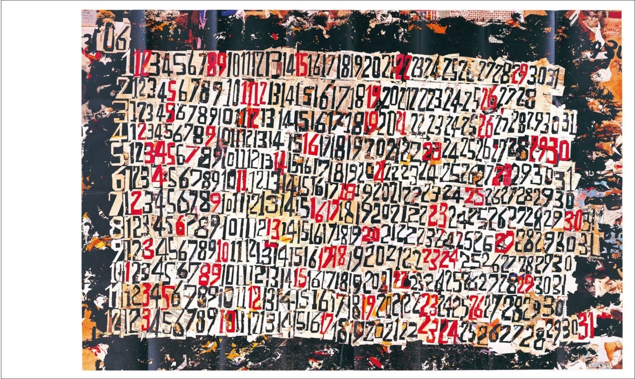
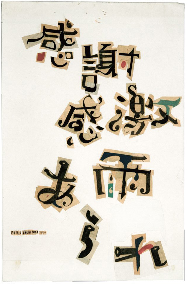
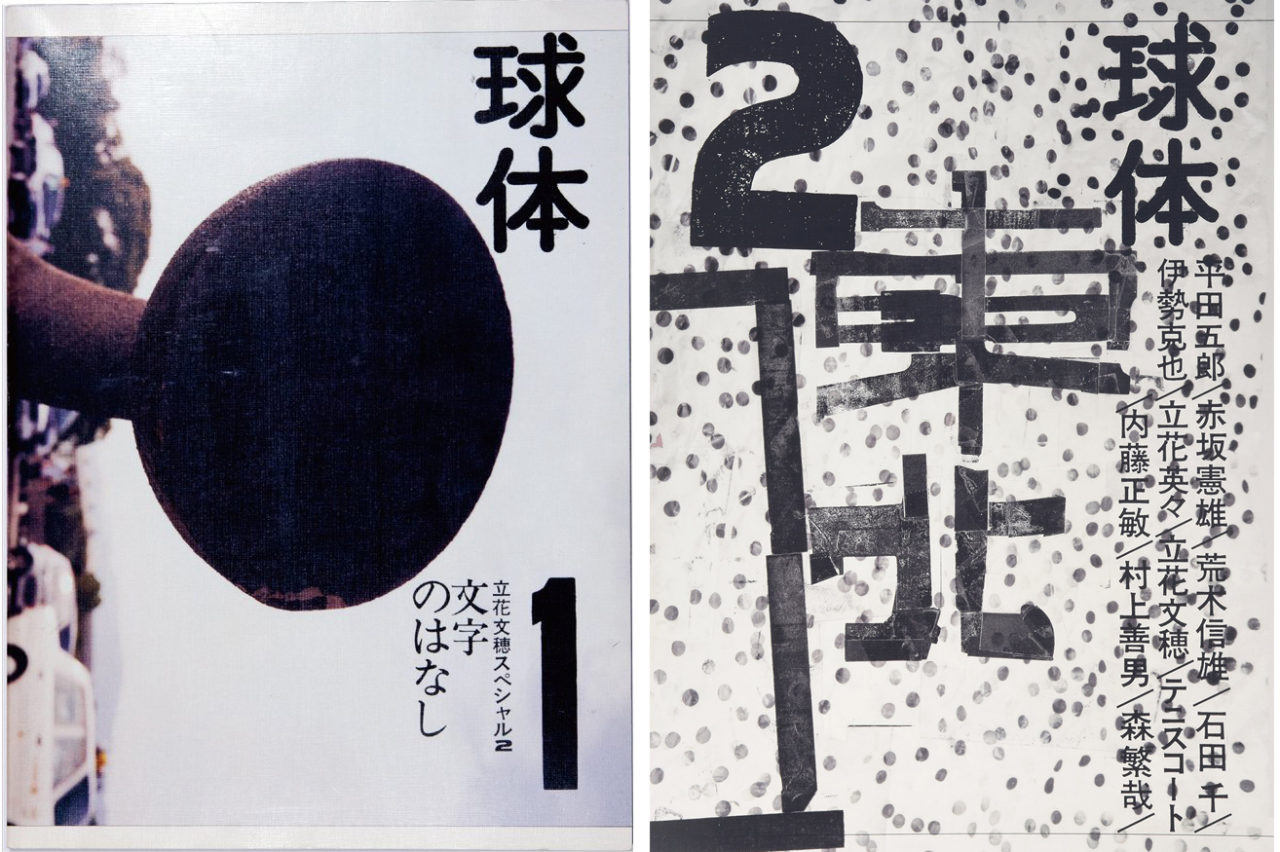
2007年,立花文穂出版了雜誌《球體》,由編輯至設計一手包辦,第一期的主題是「文字的故事」。雖是以文字相關的專題,內容卻是大幀大幀的圖片,拍攝樹木、橋、大廈⋯⋯立花文穂在序言中說:「我相信在語言誕生之前,人們便感受到文字了。人們看著高山狹谷、不息的川流、廣闊的天空、行雲、月亮的軋跡、陽光⋯⋯這些都是文字出現以前的文字。」雜誌裡沒有對這些照片加以說明,翻著雜誌時,我們觀察立花文穂觀察到的,想像他在風景裡看到的文字。
In 2007, Fumio Tachibana published a magazine called Kyutai (Sphere), which he was solely responsible for editing and design. The debut issue was themed “The Story of Words”, although it featured images instead of text. In the prologue of this issue that is full of images of trees, bridges, buildings and other objects, Tachibana wrote, “I believe human already had a concept of words before the birth of a language. Staring at mountains and valleys, the constantly flowing rivers, the boundless sky, the floating clouds, the traces of moon, sunlight… These are all words that appeared before words.” Admiring the caption-less photos, readers are invited to observe what Tachibana observed and imagine the words he saw from these sceneries.
《球體》第一期的照片系列,以及後來數期,立花文穂的作品經常被指是難以看懂。對此,立花文穂卻感到是人們的閱讀能力下降了。輕輕瞥過,表面意義不明的,便將之拒絕。「希望大家能多走一步,越過表面的意義,『到底是甚麼呢?』抱著這好奇心往裡走。」探索著未知,然後以自己的想像和經驗,給予事件與別不同的理解與意義,不都是我們兒時閱讀與遊玩時最大的趣味?願我們不會丟失這樂趣。
Reflecting on the criticism saying images in the first few issues of Sphere are difficult to conceive, Tachibana believed it was attributed to the readers’ declining literacy; people would only glance at the image and reject the ones that do not carry an obvious meaning. “I wish people could try harder to go beyond the superficial message and seek for the actual implication with a curious mind.” Exploring the unknown and interpret things based on our imagination and experience is the greatest joy when we read and play as a kid. I wish we would never forget about the pleasure of these moments.