「我希望我設計的書,在書店裡是孤獨的。就像中國畫於美術館裡的展示方式,昏暗的環境裡,只有一盞燈照耀著,光線微弱,卻被看見。」—— 林小乙
台灣書籍設計師林小乙的作品,常被形容為纖細而優雅,輕盈而豐富,如詩般,一瞬間便讀完,卻永遠讀不盡。
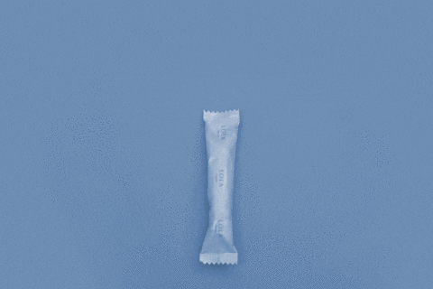
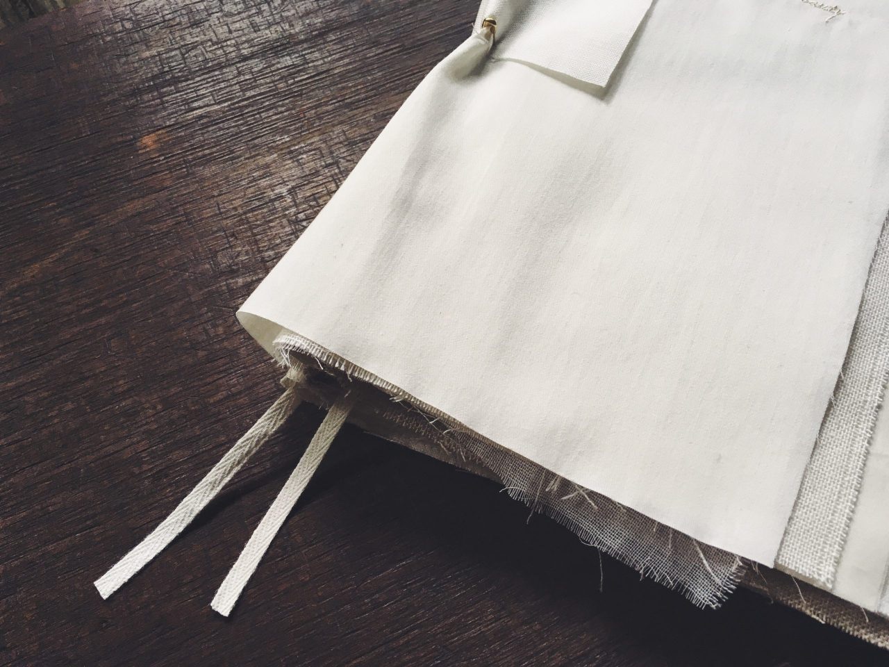
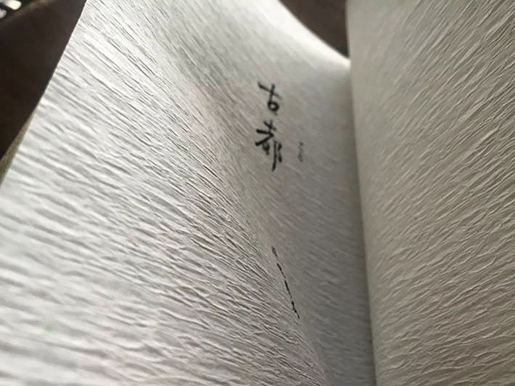
//當她接到木馬文化的委托,要把川端康成的系列作品作新的裝幀設計時,她著意將川端康成筆下四季的詩意呈現出來。其中《雪國》、《古都》、《千羽鶴》,她將作品的第一段文字放在書腰上,以布造封面,書名採用刺繡,使之看來典雅一點。《雪國》的灰白色布料覆著棕灰的紙材,如同冬雪掩蓋了萬物,透著珠光的銀白色扉頁,一翻開便感到冷風颼颼;《古都》採淡雅的蛾黃,扉頁質感蓬鬆如古樹的樹皮,又讓人聯想到京都數寄屋歷盡風霜的木牆壁,後面一頁深綠中泛著金光,如同京都般,有種壓抑的華麗。//
而這份詩意,是經過長年累月提煉出來的。
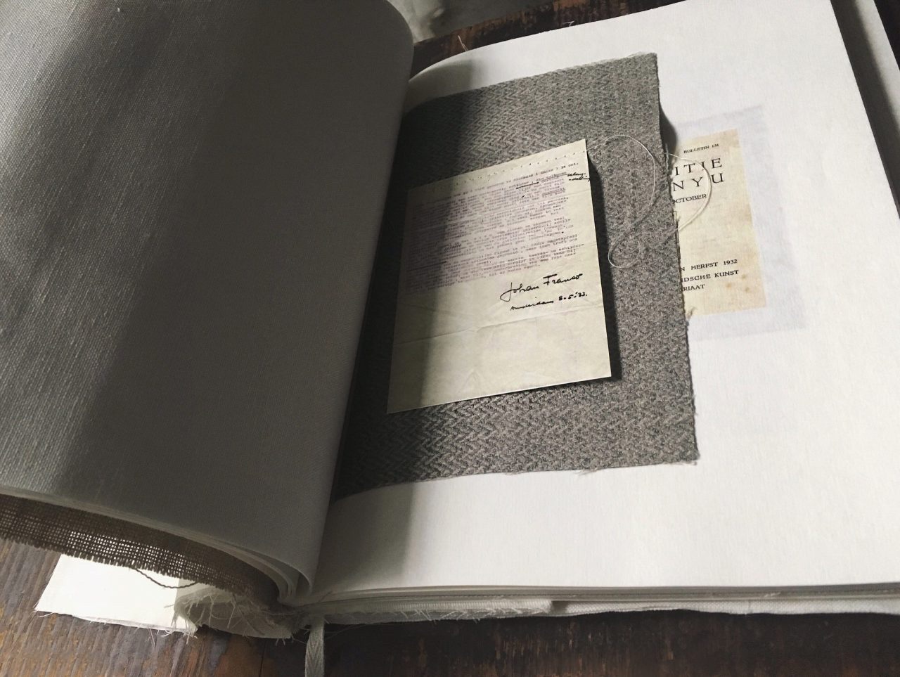
//訪問前的兩天,她給我寄了電郵,為了讓我更能掌握她的談話內容,她預先把對自己有深厚影響的創作者與事物的清單整理出來——侯孝賢、安東尼奧尼、張叔平、山本耀司、詩經、書法家懷素、建築師石上純也、京都的龍安寺……總共二十多個,奇妙地,大都是跟書籍及平面設計沒有直接關係的。然而,他們對美的執著、整理概念及將之釋放的能力、對於創作與人生的看法、以空無一物勾劃出萬事萬象的方式,都深深植在林小乙記憶的最底層,成為支撐著她的創作的根基。//
自小收集回來關於美的記憶,於林小乙著手設計時,適時回來探訪她,給予她一些提示。
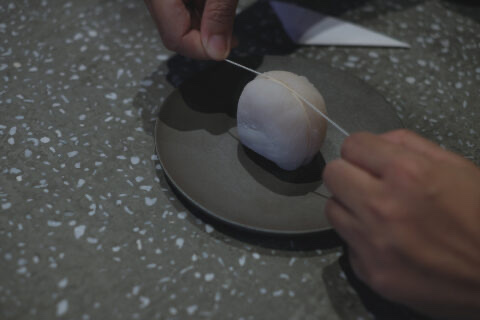
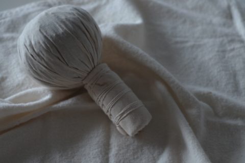
//她替香港蘇富比設計《沈睡的女神》的專書,看著藤田嗣治筆下的小雪,皮膚蒼白、飽滿晶瑩沒半點瑕疵,她忽然便想到白居易的詩作《長恨歌》中如此寫楊貴妃:「溫泉水滑洗凝脂」。凝脂,凝固了的油脂,形容女生的皮膚光滑無瑕,林小乙想將這意象表現在專書的設計之上,她決定在書本外做一個純白的蠟盒包覆著書,撫摸時就如同觸踫到畫中女性的身體。//
《OBSCURA》2016年秋冬季號,我們以20版的專題介紹台灣書籍設計師林小乙。只是再多的版面,都不夠呈現她的深邃與獨特。
(文中引文摘自《OBSCURA》2016年秋冬季號。)
“I wish the books designed by me can enjoy solitude in a book store. This resembles Chinese painting in art galleries when only one dim light is used to subtly brighten the painting in a dark dusky room. Yet it will still be seen.” Lin Xiao-Yi
Many regard the Taiwanese book designer Lin Xiao-Yi’s works as delicate yet elegant, soft but rich; her works are like poetry, which takes just a short time to finish reading, but has no limit for interpretation.
// After taking a commission work from Ecus Publishing House to redesign Yasunari Kawabata’s collection, she decided to actualize the four seasons as depicted by Kawabata. For Snow Country, The Old Capital and Thousand Cranes, Lin put the first paragraph of the works on the tummy bands. Book covers are made with fabric, book titles sewn to the cover – a presentation of elegance. The fabric she found in Taiwan did not have a good enough density, so she ordered some from the Netherlands, paper was on the other hand ordered from Japan. Snow Country features a greyish off-white fabric covering brownish grey paper, appearing like a scene covered by winter snow. Through the glittering silver white title page, opening the book feels like letting in the cold breeze. The Old Capital adopts a subtly elegant light yellow. Texture of the title page resembles barks of an old tree, which reminds readers of the wooden wall of the historic Kyoto; the colour of gold shines from within the dark green page, this is like putting the restrained splendour of Kyoto on paper. //
The poetic quality in her works is a reward from her accumulated experience.
// Two days before our interview, to help me better grasp the context of the conversation, Lin sent over an organized list of people and things that cast significant influence on her –Hou Hsiao-Hsien, Michelangelo Antonioni, William Chang Suk Ping, Yoji Yamamoto, Shi Jing, calligrapher Huai Su, Architect Junya Ishigami, Ryoanji Temple in Kyoto… Intriguingly, most of the 20 items in the list have little to do with books and graphic design. However, it is their dedication to beauty, the way they formulate and express idea, the attitude towards creation and existence, the manner of creating from nothingness, that constructed the deepest part of Lin’s memory, and in turn became the foundation of Lin’s creativity. //
Collecting memories of beauty is a habit that Lin has developed ever since childhood. Revisiting these memories when making new design allows Lin to discover more directions for creativity.
// Designing La déesse du sommeil for Sotheby’s Hong Kong is an example. Tsuguharu Foujita’s Yuki has pale, plump and flawless skin. Looking at her, she thinks of how Bai Juyi describes Yang Guifei by saying “The smooth waters of the hot and washed over her pale white skin.” in “Chang Hen Ge”. Literal translation of the line actually uses curd of grease as a metaphor of flawlessly smooth skin of female. This imagery is the concept behind using a pure white box of wax as a book cover. She wants readers to feel the smoothness of female body when touching the book. //
OBSCURA Autumn & Winter 2016 presented a 20-page feature on the Taiwanese book designer Lin Xiao-Yi. Even if the feature could run even longer, that still wouldn’t be enough to fully demonstrate the unique depth of Lin.
(Abstract from OBSCURA Autumn & Winter 2016.)