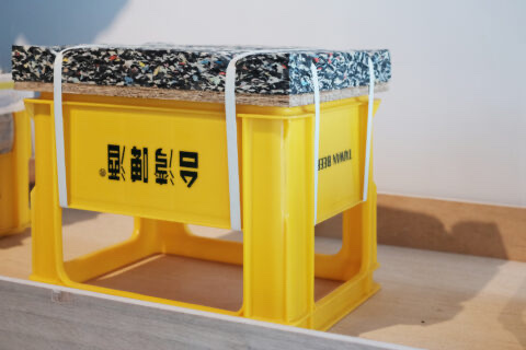
日本大概是最擅用紙張的國家吧。貼在障子上的和紙,隔著冷空氣也柔和了光;屏風上的印上了閃亮圖案的唐紙,反映了光線也透露著時間;建築師坂茂甚至以紙作為建築結構;當然,印刷、書寫、包裝等,都是紙張理所當然的用途。
去年,因製作NHK的教育節目「Design Ah」而廣為人知的岡崎智弘受邀於印刷公司福永紙工,設計暫新的紙張製品時。福永紙工過往曾不少設計師合作,例如跟Torafu建築設計事務所,一同企劃及生產了著名的「空氣之器」、與和田恭侑合作了「Face Pop Up Card」系列等,全都是主題明確的商品。不過,新企劃落在岡崎智弘手中,他卻認為紙張對日本人來說本是熟悉的素材,歷史悠久,比起費煞思量構思有趣主題,他更感興趣的是人們對這熟知的媒體,有著怎樣的想像。
岡崎智弘後來替福永紙工策劃了名為「紙工視點」的計劃,請來了荒牧悠、小玉文及 Sizuka Tatsuno 三位年輕女設計師,自行對紙張作演繹。其中以Sizuka Tatsuno的作品最為引人注目。
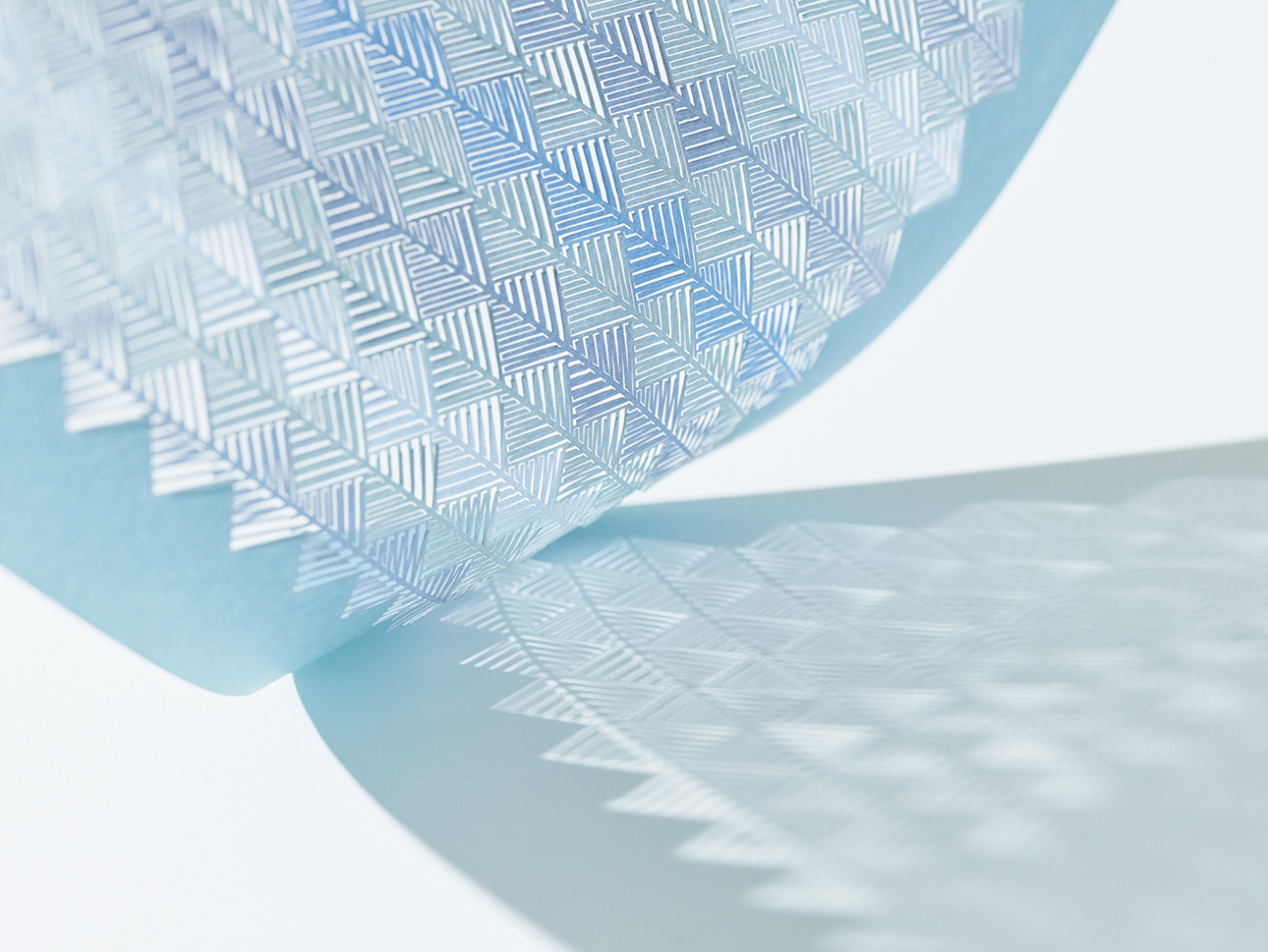
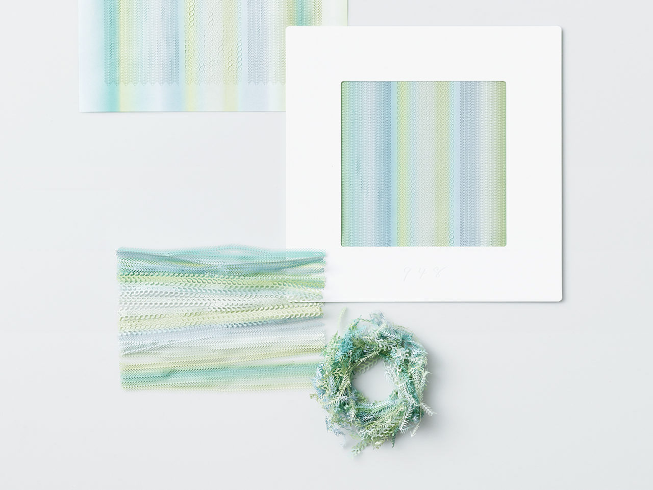
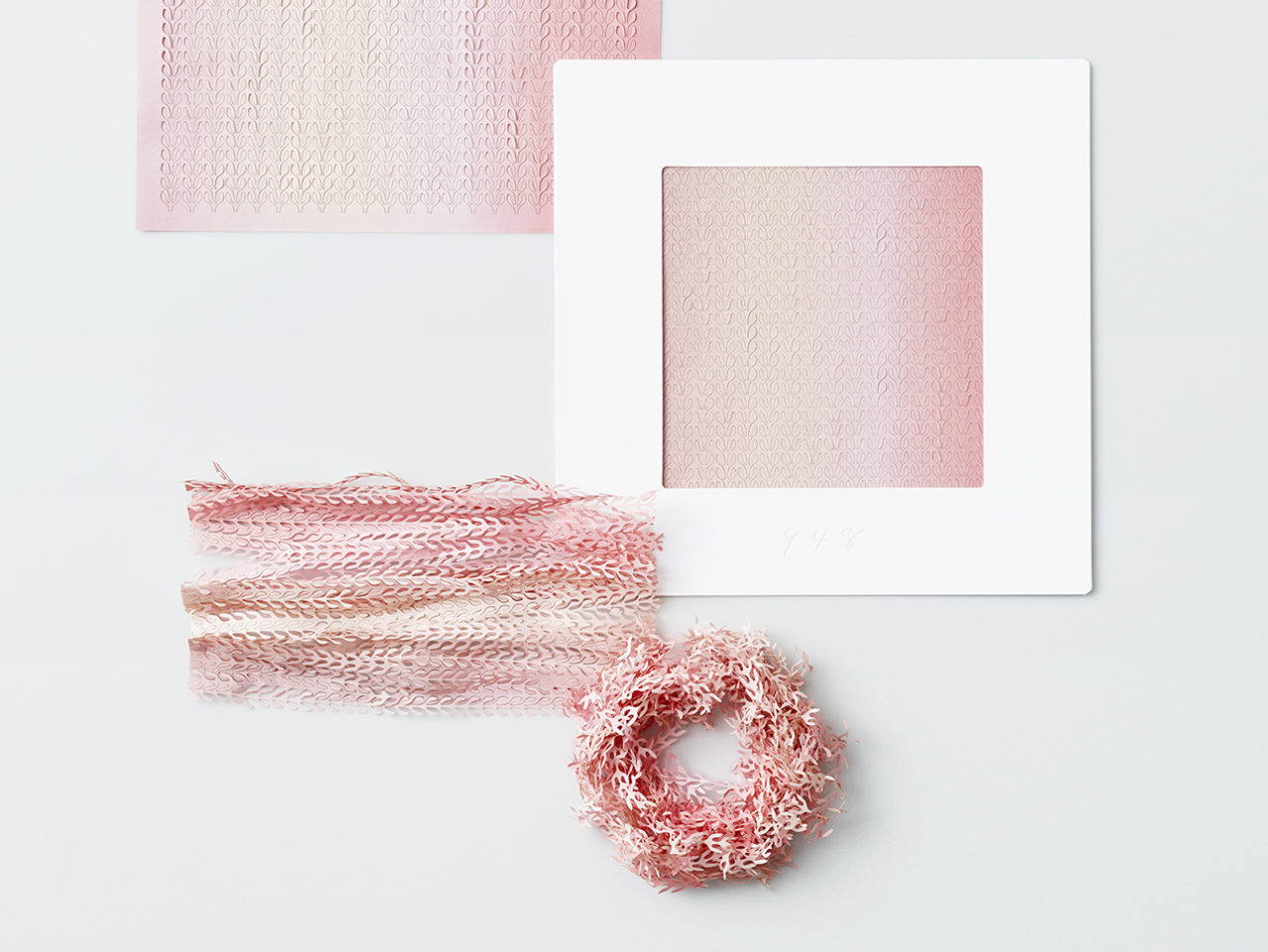
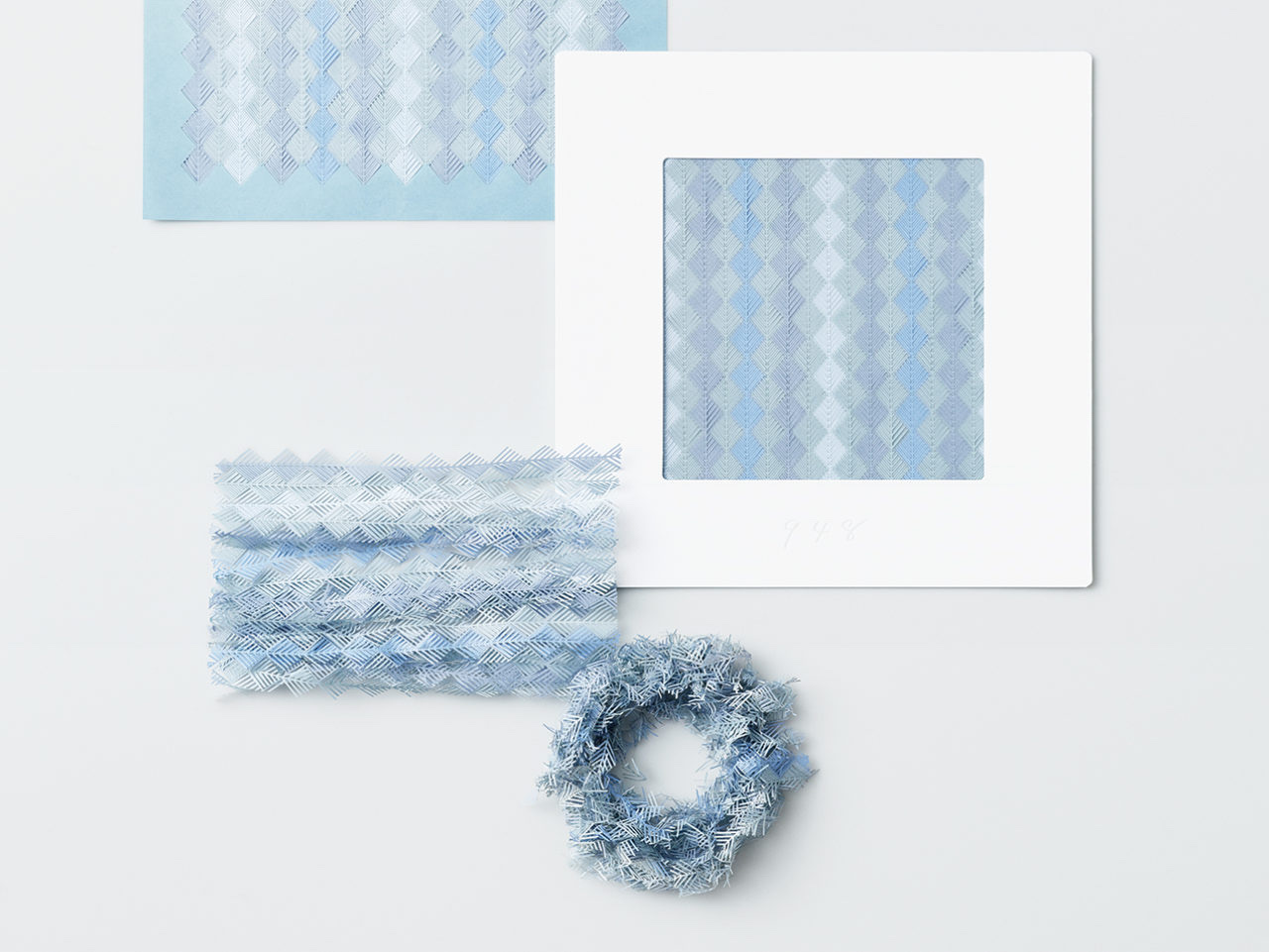
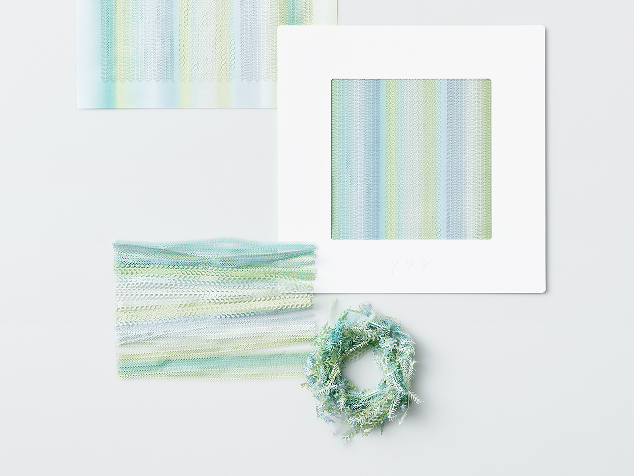
名為「948」的作品,看來彷如蕾絲一樣柔弱而纖細,而靈感竟然是來是用來包裝物品,以防止過送時受到撞擊的緩衝材料。Sizuka Tatsuno接受到邀請時,在腦中立時浮起的概念是「叫人重新審視身邊常見的紙製品」,最終想到的便是緩衝材料了——被切出無數細縫的紙張,雖然單薄,但給捏成一團時,便變得堅實,具有強大的保護能力。Sizuka Tatsuno希望人們能夠對緩衝材刮目相看。
Sizuka Tatsuno善用了福永紙工精湛的印刷及切割技術,造成了948。948,是日本クシャ諧音,意指皺巴巴,暗示了色彩溫柔、柔軟質感的948,在捏皺以後使用方式的自由度使大大提升了,能用作緩衝材料外,也能作為家居裝飾。
There is probably no other country better at papercraft than Japan. The traditional paper washi over shōji, or room dividers, is exceptional at blocking cold air and diffusing light. Used on folding screen, the karagrami paper printed with pretty patterns helps to reflect light and also tells us about the time. The architect Shigeru Ban even constructed buildings primarily out of paper. Of course, the most expected usages of paper still go to printing, writing, and packaging.
Made popular by NHK’s educational program Design Ah last year, Tomohiro Okazaki was recently invited by the printing house Fukunaga Print Co. Ltd. to design a new series of paper products. The printing company has previously collaborated with a number of designers. Apart from co-producing the renowned series “Airvase” with Torafu Architects, they have as well joined force with Yasuyuki Wada to launch the “Face Pop Up Card” series. All these end products feature sharp themes that leave a lasting impression. When it comes Okazaki’s turn to take up the new project, he focuses on the fact that paper is supposed to be the most familiar material to the Japanese that can date back a long history. So instead of deriving yet another gimmicky theme, he tries to dig into how people actually perceive this household medium, and what kinds of the imagination do people hold.
Okazaki then organized for Fukunaga Print Co. the “Perspective of Paper Craft” project and invited three young female designers, Haruka Aramaki, Aya Codama, and Sizuka Tatsuno, to elaborate their own interpretations on paper craft. Among them, the work by Sizuka Tatsuno was the one that drew the most attention.
With an intricate design that looks like lace, Tatsuno’s work, named “948”, takes in inspiration from wrapping materials that provide cushioning for fragile or sensitive objects. Tatsuno admitted that such cushioning material is the ultimate thing that comes to her mind when the invitation inspired her to revisit the paper products in everyday life. Tatsuno’s paper design features delicate cuttings; when crushed together the paper would become solid for great protection despite the thinness. Tatsuno wishes to offer people a new angle to see cushioning materials.
Tatsuno has well utilized the state-of-the-art printing and cutting techniques to produce “948”, its pronunciation in Japanese “kusha” is homophonic to the phrase “クシャ” meaning “crumpled, wrinkled”. This implies that the soft looking texture of “948” is able to provide versatile usages when crumpled. Other than being used as cushioning material it can also serve as a piece of decoration.