在2014年的時候,挪威政府公開招募新護照的設計方案,而來自奧斯陸的團隊Neue,就以極簡主義風格,並在內頁以UV防冒技術來呈現挪威自然景觀,最終在眾多投稿中脫穎而出。該設計從釋出之日,即受到挪威國內外一片好評,而經過漫長的六年開發時間,護照設計終於在今年正式釋出,就讓我們來看一下,這個當初廣受好評的設計,最終的開發模樣為何。
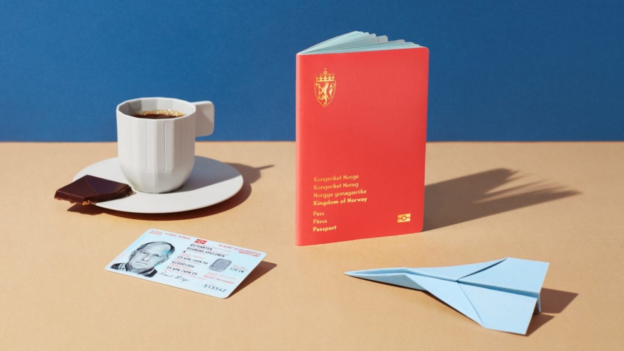
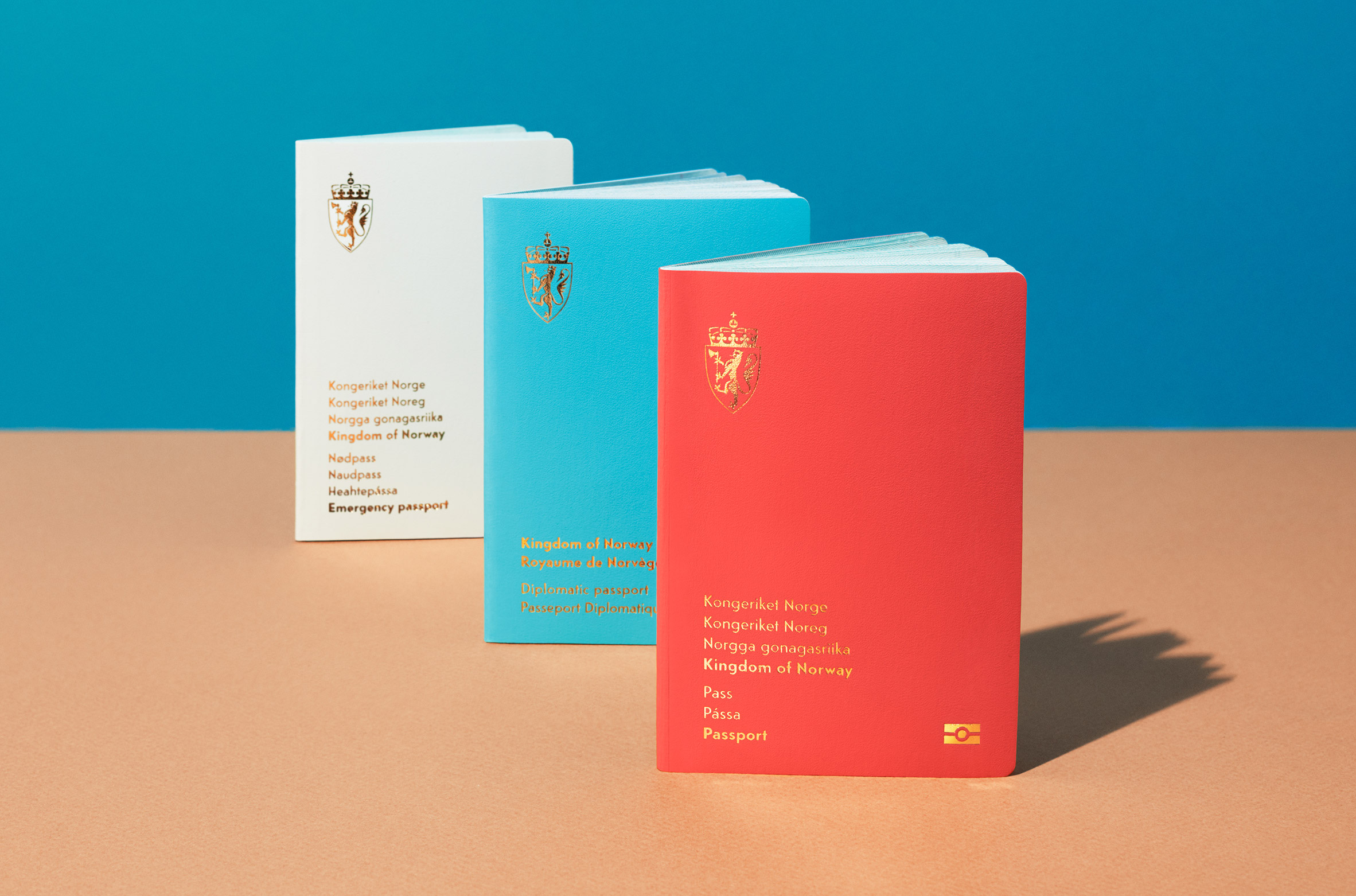
與六年前的封面設計一樣,護照採取一式三分,由左至右分別是國民護照,外交護照和緊急用護照,而白、藍、紅三色,也剛好呼應了挪威的國旗色。在設計上挪威護照有別於傳統,像是國徽就從通常的居中位置,被縮小放到封面的左上角;而文字的設計亦如是低調,儘管用上燙金字體,卻因為縮小、左側排的處理,使護照有一份別樣的極簡感。
In 2014, the Norwegian government hosted a competition inviting designers from all over the country to redesign Norway’s passports. Among the numerous submissions received, Oslo-based Neue Design Studio stood out from the crowd and won the contest with its minimalist yet practical design that features advanced security measures and abstract illustrations of Norwegian landscapes. After spending six years in development, the finalised version of the new passports is now unveiled.
Following the original design concept revealed six years ago, the travel documents include the Norwegian national passport, diplomatic passport, and emergency passport. The exteriors are coloured white, blue, and red respectively, which can be seen as a nod to Norway’s flag. Instead of centred as was formerly done, the national coat of arms are now emblazoned in the upper left of the front cover. There is also an unusual off-center alignment for the cover text in gold finishing. All of which gives the cover a simple yet solemn appearance.
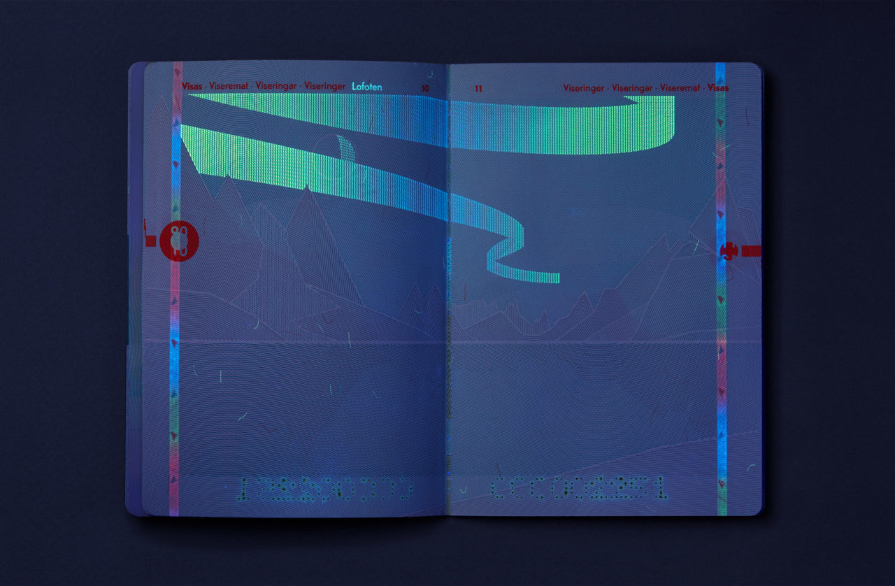
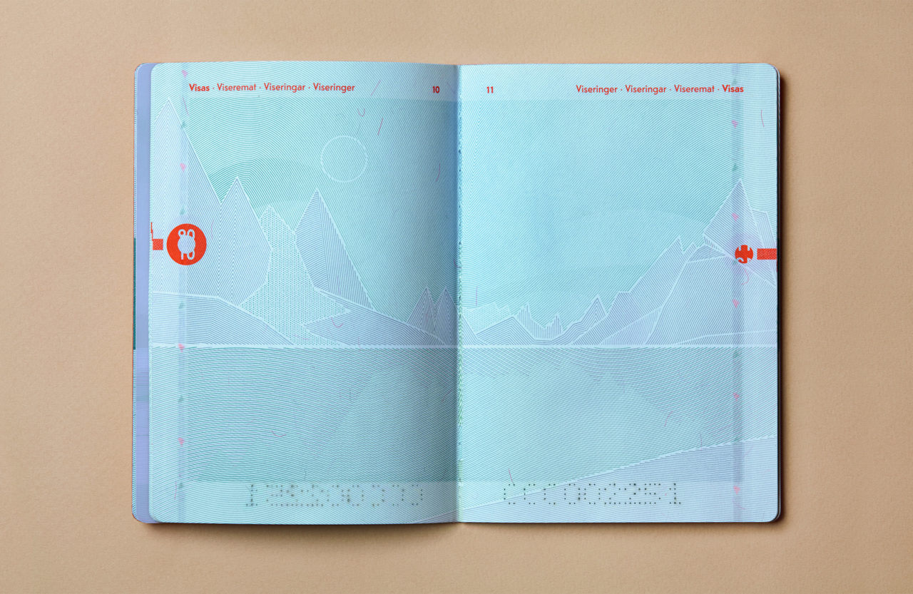
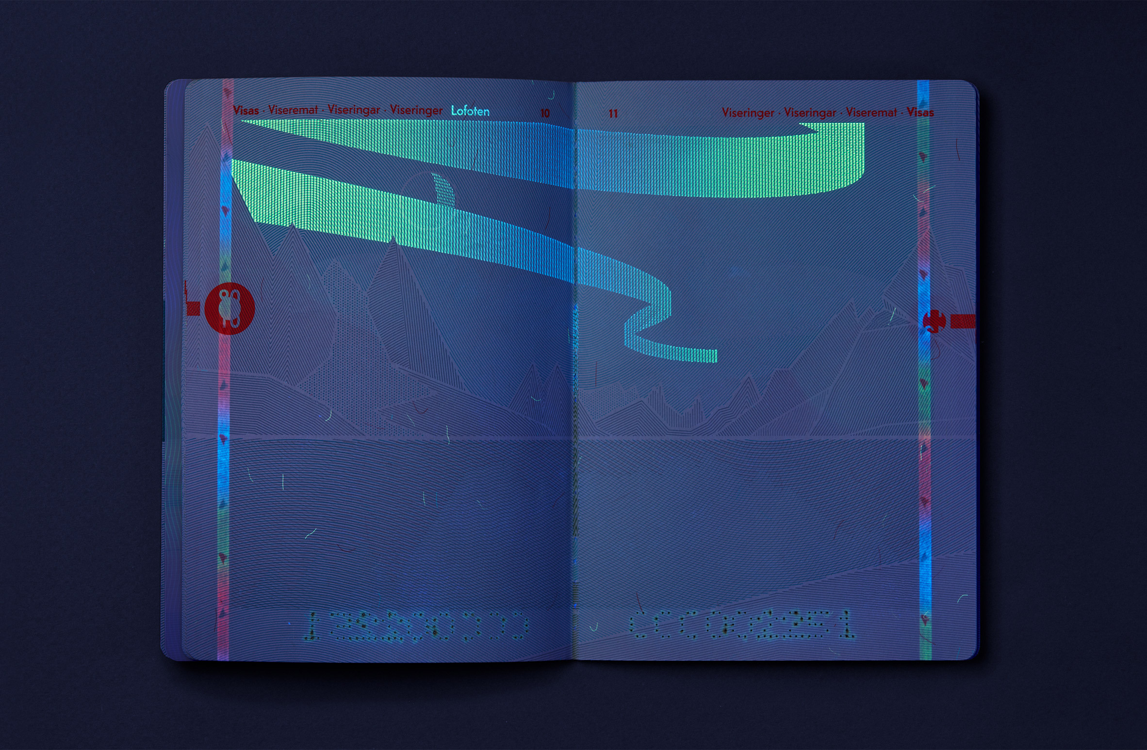
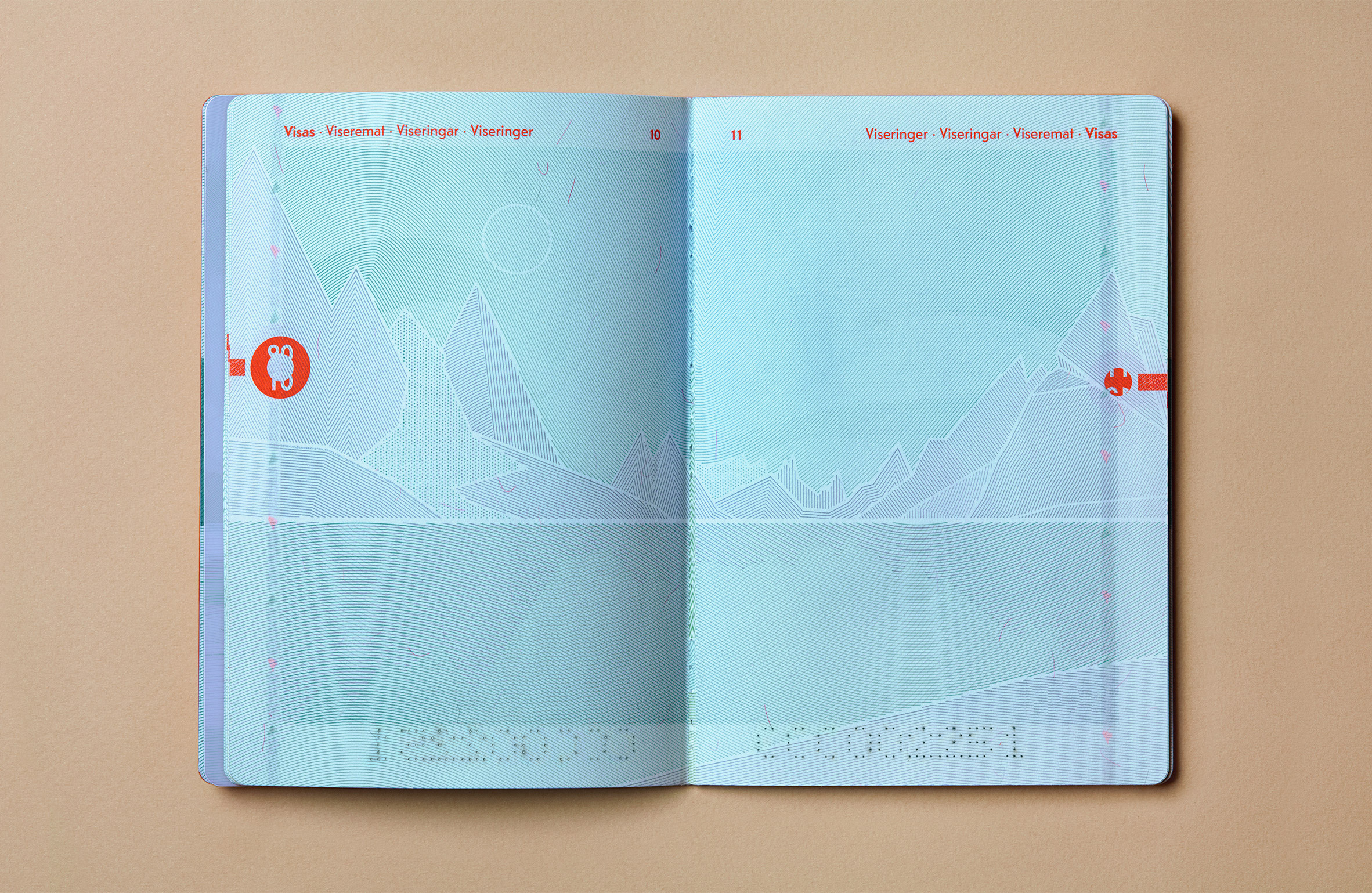
談完護照的封面,自然也要談談它的內頁設計,也是整個設計中最驚豔的地方。設計團隊把本來用於防冒的UV技術,融入在挪威的湖光山色中,當中內頁的風景插畫,只要拿到UV燈下一照,即從白晝變成夜晚,透發出極具魅力的挪威夜景。除此以外,有部分內頁也用上螢光藍、綠的色帶,來呈現蔚為奇觀的挪威極光。而在這些人驚喜連連的設計背後,都是設計師對挪威景緻的禮讚,能讓國民在離開國境時,仍能靠這一紙文件,連結回國內那巍峨的山稜線,催燦的北極光,感受那份北歐國家獨有的風光。
The new passports are also lauded for their thoughtful internal pages design that makes great use of UV light. Inside the passports, each page is printed with a different abstract illustration of Norwegian landscape including mountainous scenes with lakes and streams. These illustrations work as decoration as well as a security element; when placed under UV light, the landscapes will transform from day to night revealing a dazzling Norwegian night scene. In addition, there are some pages that reveal ribbons of fluorescent blue and green that represent the northern lights adding a sense of intrigue to the already stunning design. One might consider the Neue-designed passports a showcase of love of nature or a tribute to the sweeping Norwagian panorama, yet what’s more, the documents serve to create a sense of belonging for the passport holders and connect them to their hometown and mother nature wherever they are in the world.