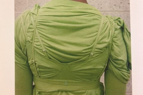
日本文化中的「Monozukuri」表面上有「造物」的意思,多用來描述日本傳統工藝,如和服、和紙和陶藝等,然而它還包含承傳下來的技能、知識、品質、熱情和職業道德等無形概念。有些人說這個字蘊藏日本文化的含義,因此無法完整地翻譯成其他語言。如果無法以言語表達,或許可以嘗試以身體去感受,好像是看似簡單日常的T恤也能表現出日本品牌45R的「Monozukuri」精神。今季推出的「45RPM」logo tee系列,由材質、剪裁、設計方面皆注入了不少心思,豐富繽紛的色彩猶如慶祝夏季的來臨,使每天都能穿上的T恤成為衣櫃裡的cherished item。
The Japanese word monozukuri means “creation” and is often used to describe the making of traditional Japanese crafts such as kimono, washi paper, and pottery. However, the true essence of monozukuri goes beyond just the act of creating; it embodies a deep sense of inherited skills, knowledge, quality, passion, and professional ethics. Some people say that it is impossible to fully convey the meaning of monozukuri in another language because it is so deeply rooted in Japanese culture; if that’s the case, perhaps we can try to feel its essence and understand it through experience? Indeed, the T-shirts from the Japanese brand, 45R, are not just ordinary pieces of clothing, but rather a manifestation of the monozukuri spirit. The brand’s logo tee series for this season showcases their thoughtful design, meticulous cutting, and use of high-quality materials. The rich, vibrant colors used come across as a celebration of summer’s arrival, making these T-shirts a cherished item in anyone’s wardrobe.

Durable and timeless, like a vinyl record.
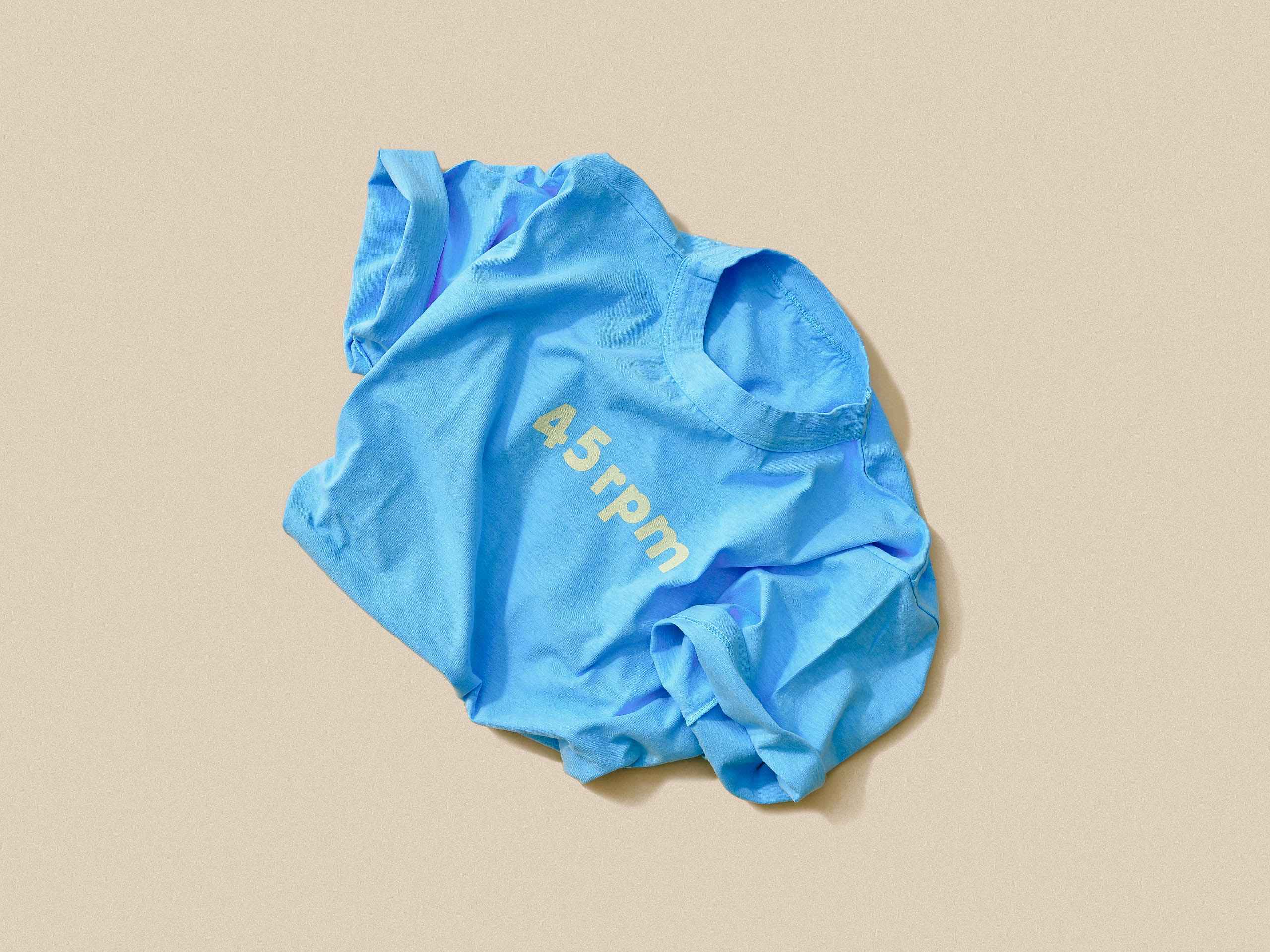
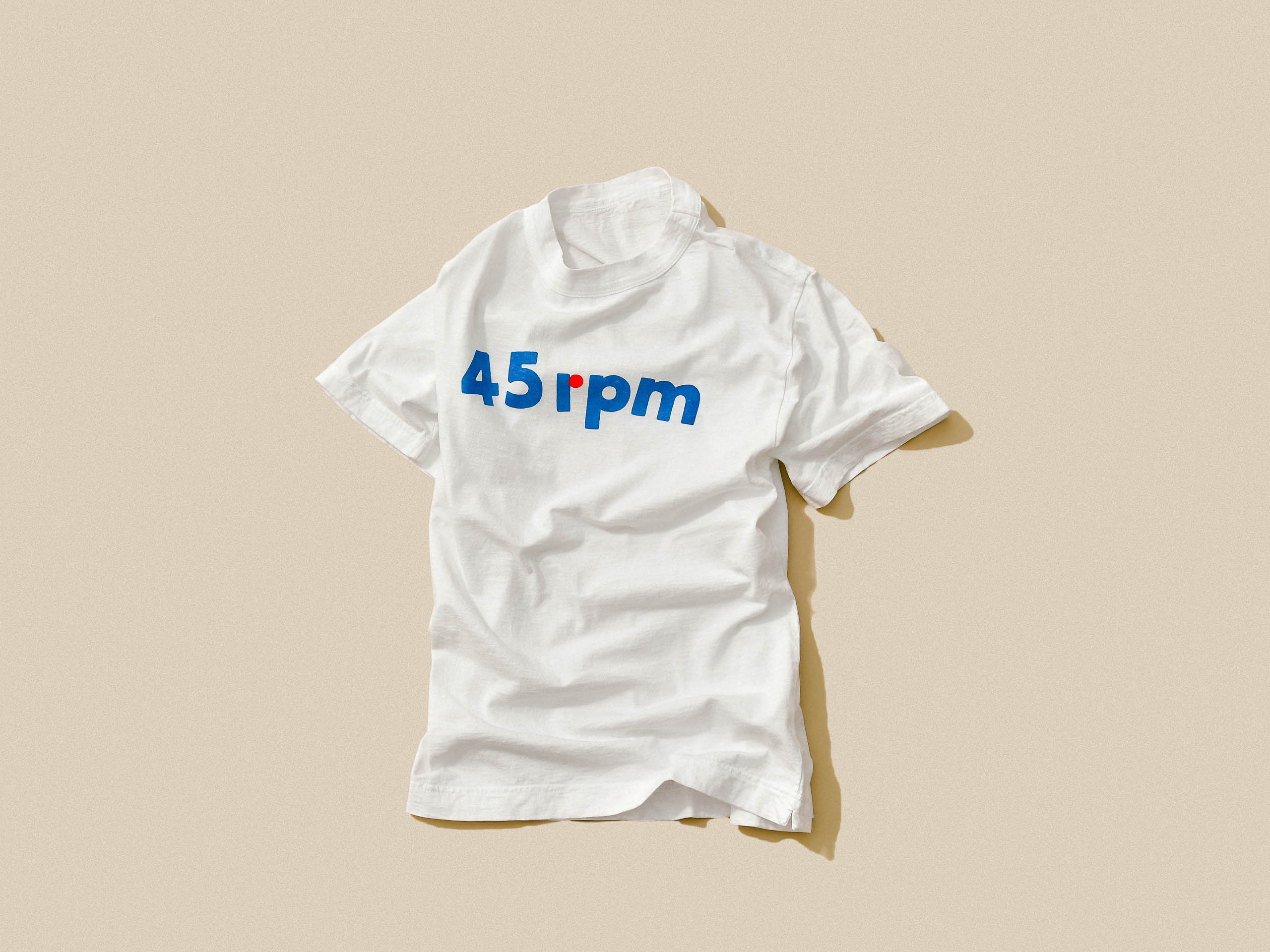
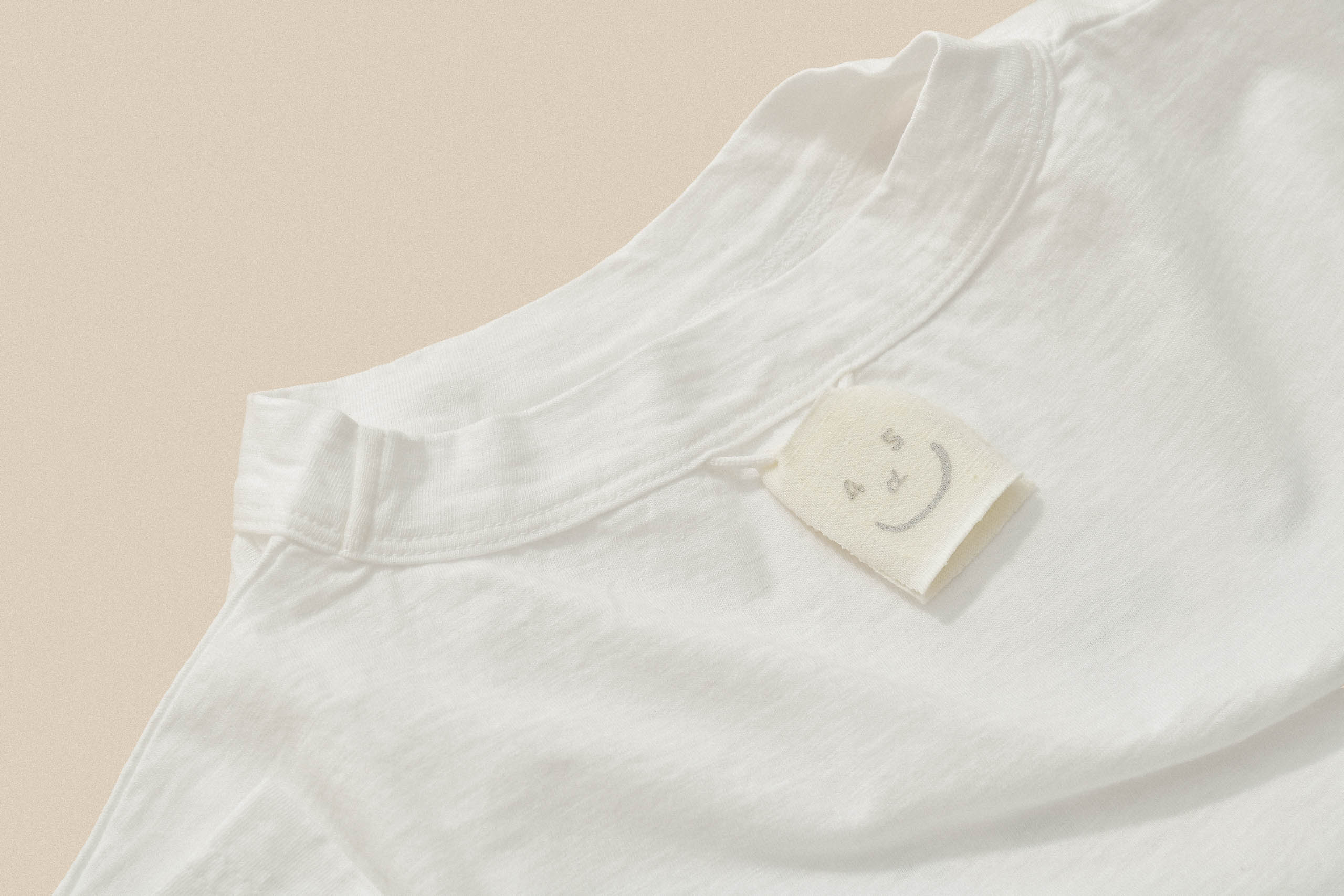
系列的T恤上印上品牌的前名字「45RPM」是與黑膠碟有關,因為黑膠碟每分鐘會轉動45次,一向鍾情懷舊美的創辦人也希望品牌像旋轉中的黑膠碟般,播放的歌曲能一直流傳下去。後來名字簡化成「45R」,當中的「R」有Roots的意思,代表「堅持製作永不過時、舒適耐看又能代代相傳的服裝」的初心。今季重新使用「45RPM」,並反覆試驗字體組合:字母的邊緣是否該圓一點?線條稍微扭曲一點會好看些嗎?顏色配搭又該有哪些?經過設計師精心的考慮,創作了T恤上簡潔可愛的logo,如呈富士山形狀的logo和加上圓點的Tricolor logo tee,細膩的心思讓我們重新感受品牌的原始魅力。
This season, 45R pays tribute to their roots by incorporating their former name, 45RPM, on their T-shirts. The brand’s founder, who has always been fond of nostalgia, envisioned the brand as a spinning vinyl record, playing songs that could be passed down through generations. Taking inspiration from the playing speed of vinyl records at 45 revolutions per minute (RPM), the brand was first named 45RPM and later shortened to 45R, with the “R” standing for “roots”, representing the founder’s original intention of “persistently creating clothing that is timeless, comfortable, durable, and can be passed down through generations.” In designing the logos for this season’s T-shirts, the 45R team experimented with various font combinations and color schemes, carefully considering even the smallest details such as the rounded edges of the letters and the twisted lines. Ultimately, they settled on a few simple yet thoughtful designs, including a logo resembling Mount Fuji and a tricolor design with a dot added. These logos not only pay homage to the brand’s heritage but also represent the brand’s commitment to the values of creating clothing that is both beautiful and enduring.
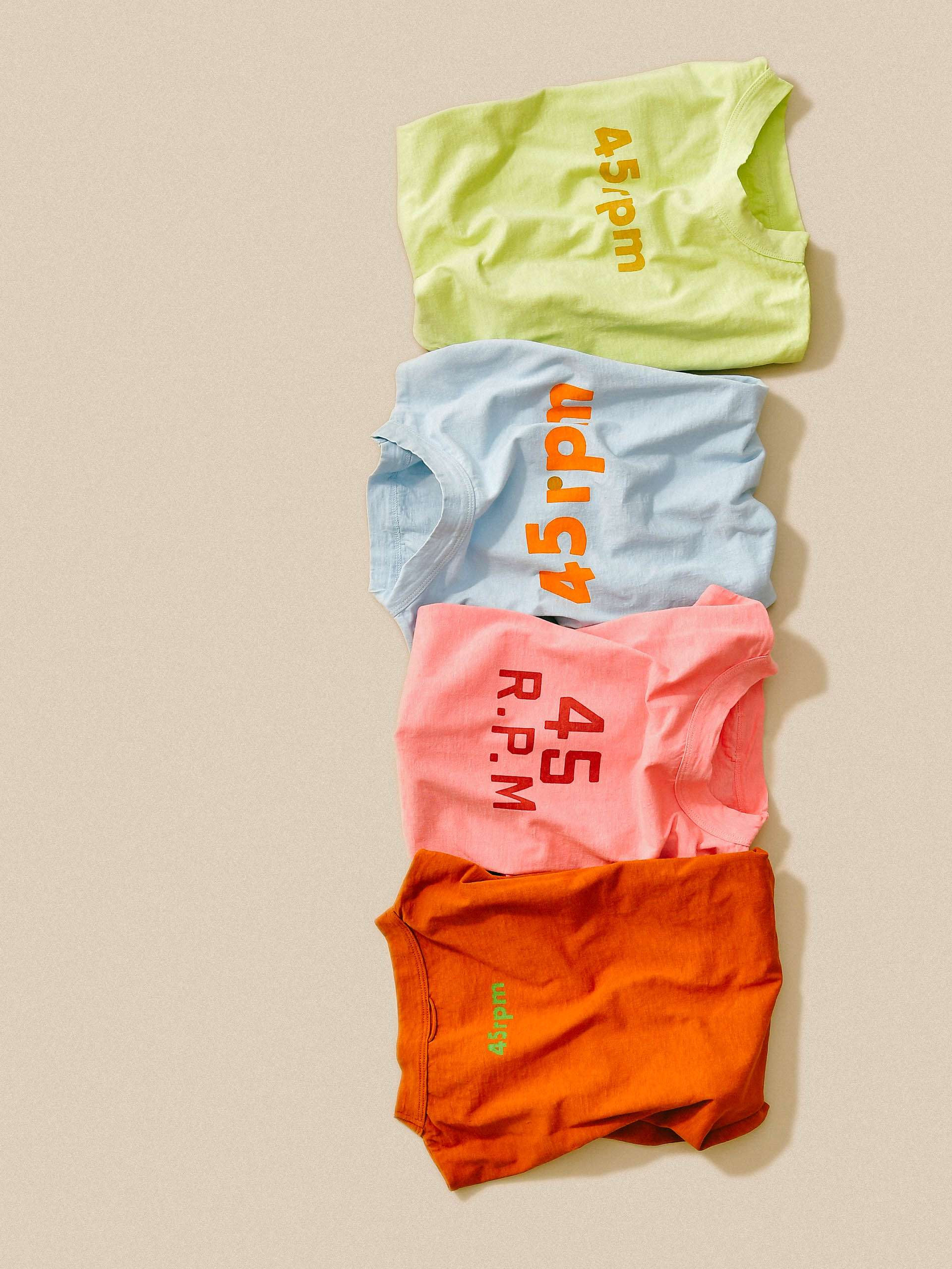
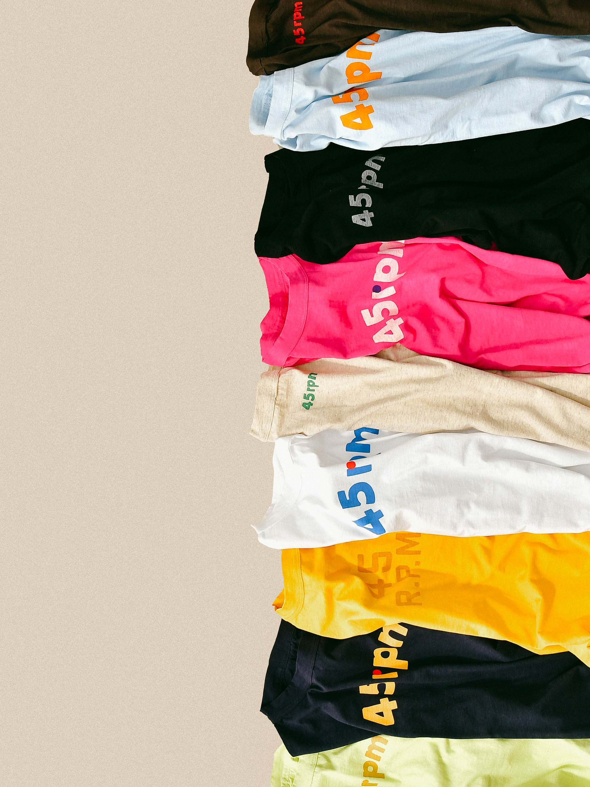
四款logo tee都各有特色,印上單色logo在前幅的Futura logo tee顯得簡潔摩登、Fuji logo tee採用tone on tone 的logo呈富士山形狀的祝賀標誌、Piccolo logo tee低調地於背面印上小楷logo,還有Tricolor logo tee在r上加上圓點,使布料、logo和圓點碰撞3種顏色,既搶眼又有心思。
Each of the four logo tees has its own distinct features, showcasing the brand’s attention to detail . The Futura has a clean and modern aesthetic with a monochrome logo on the front, while the Fuji features a tone-on-tone logo in the shape of Mount Fuji as a celebratory symbol. The Piccolo is more understated, with a small cursive logo discreetly placed on the back. The Tricolor has a dot added on top of the “r” in the logo, creating a striking contrast between the fabric, logo, and colors.
Crafted and printed by skilled artisans.
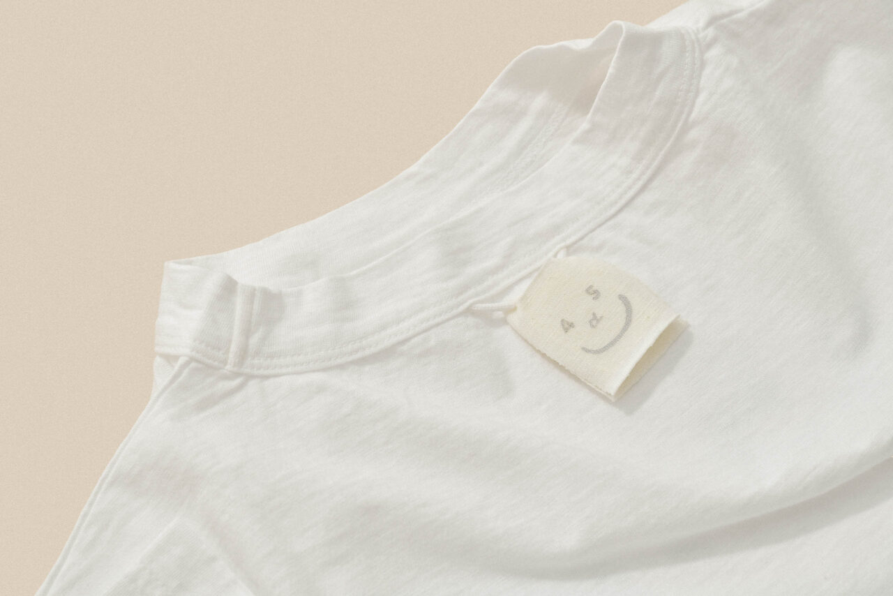
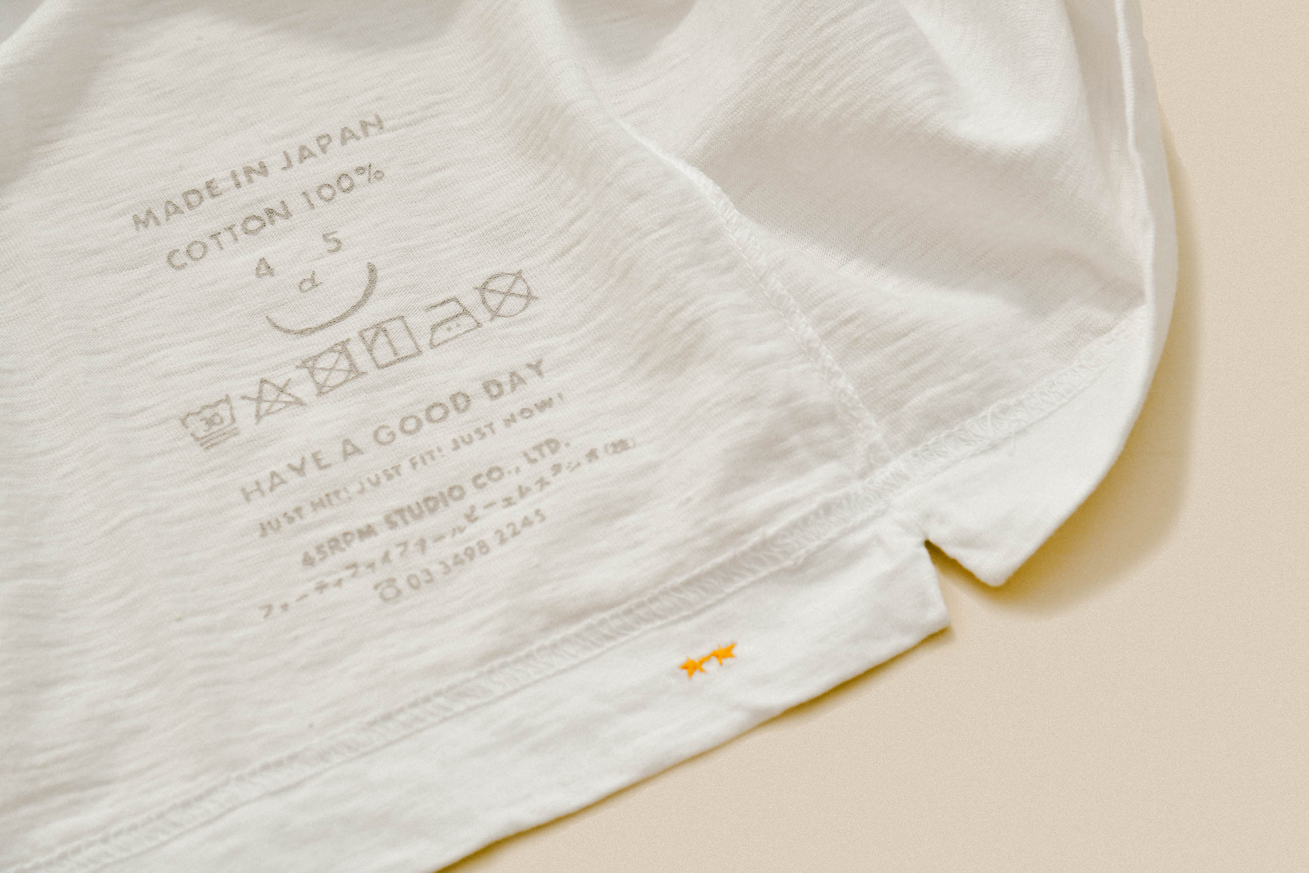
為了穿起來乾爽舒適,系列採用了來自非洲及人手採摘的津巴布韋棉,不但充滿光澤感,而且柔軟親膚又強韌,經過多番洗滌也不會變得殘舊。加上,每件T恤都是由東京一家歷史悠久的印刷廠裡的工匠,利用傳統的木板絲網逐一印刷在衣服上,墨水滲入凹凸不平的布料上,隨著時間推移而日漸褪色,表現出溫暖而漂亮質感。
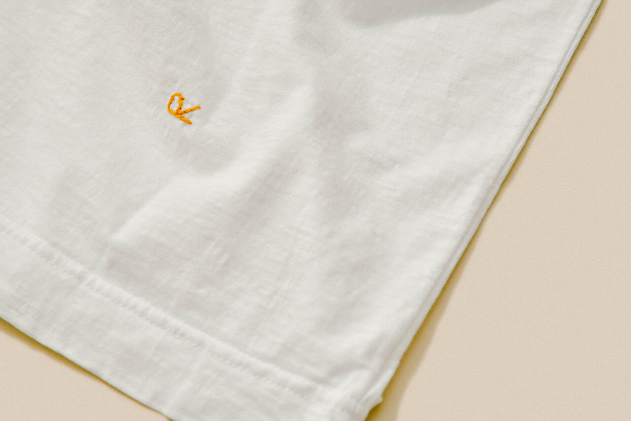
為了提升舒適度,設計師捨棄一般的縫製在T恤內的質量標籤,而是把衣服的質量信息直接印在布料上,提升衣服與皮膚之間的觸感。工匠把手寫的字母一個一個地剪下來印在布料上,印出來的文字帶點不工整,體現人手製作的溫度,以及45R對工藝的堅持。
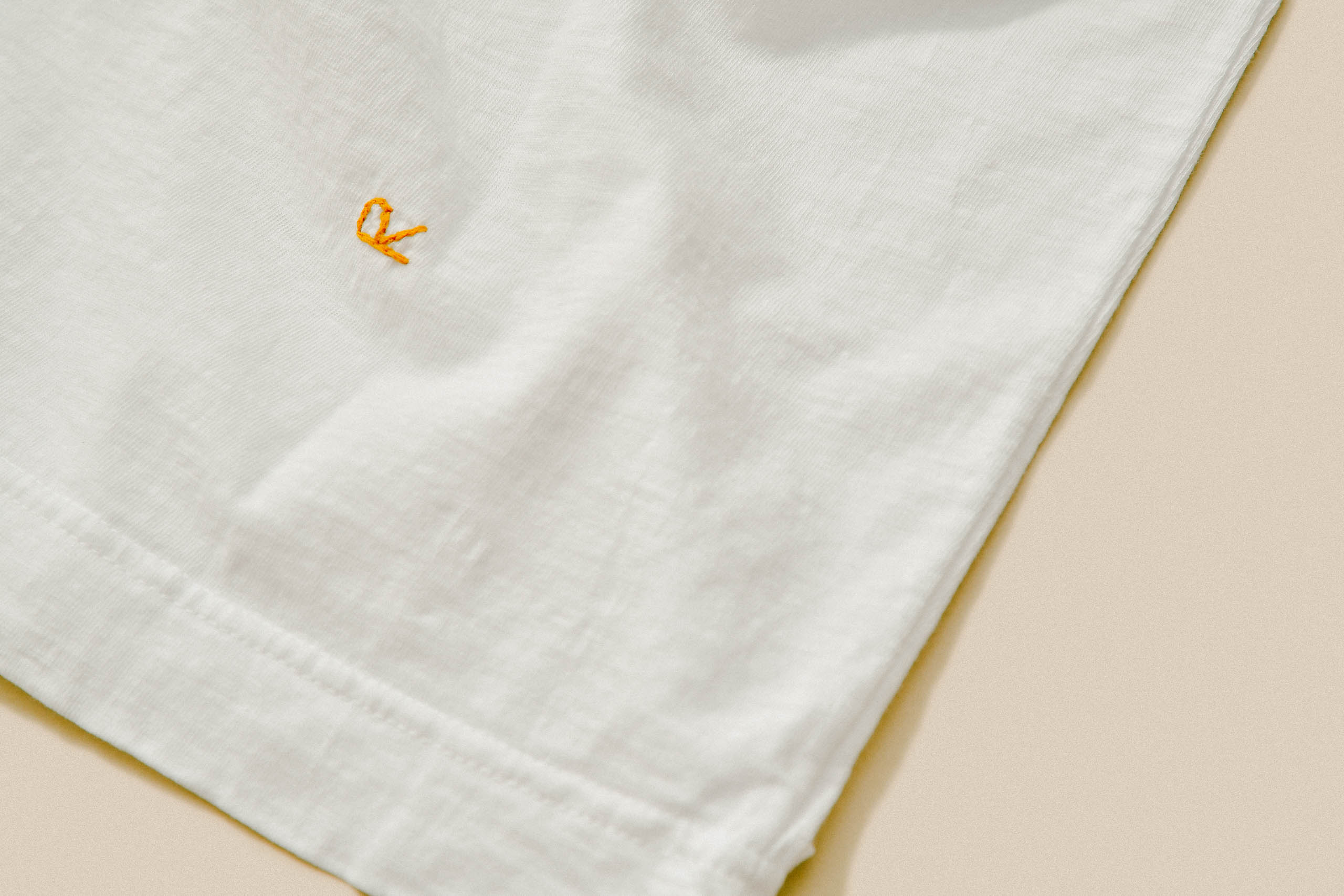
即使顏色開始褪淡、領子開始磨損,並不會影響品質,反而能為它增添個性,漸漸成為一件獨一無二的cherished item。
To ensure dryness and comfort when wearing, the logo tee series uses Zimbabwean cotton that is hand-picked and sourced from Africa. This cotton has a lustrous feel but is also soft, durable, and skin-friendly, making it perfect for everyday wear. It retains its quality even after multiple washes, ensuring the T-shirts last for years to come. In addition to the high-quality cotton used, each T-shirt is hand-printed by skilled craftsmen at a long-established printing factory in Tokyo. The traditional woodblock and screen printing techniques used ensure that the ink penetrates the uneven fabric, creating a warm and beautiful texture that gradually fades over time. This unique fading effect is a testament to the durability of the T-shirts and adds to their overall timeless appeal.
In their pursuit of comfort and attention to detail, 45R has gone beyond traditional practices. Rather than stitching a quality label inside the T-shirt, the designer opted to directly print the quality information onto the fabric, creating a smoother and more comfortable feel against the skin. To achieve this, the craftsmen carefully cut out each handwritten letter and printed them onto the fabric, resulting in slightly imperfect lettering that reflects the warmth and charm of hand-made craftsmanship. This approach not only enhances the comfort of the T-shirts but also demonstrates the brand’s commitment to preserving traditional craft techniques in their clothing.
Over time, the colors may fade and the collar may wear, but this does not diminish the quality of the T-shirt. Instead, it adds character and personality to the garment, making it a unique and cherished item in the wardrobe.